Propelled by sweeping policy, financial and lifestyle reforms being proposed to limit or mitigate its effects, climate change has become one of the major concerns of our time. In one way or another, it now touches virtually every aspect of our society, from our health and economy to our culture and values.
There is no shortage of press releases, research findings or news articles to shape our perception of the climate threat. Whether it’s studies published by the UN, NASA or NOAA, or reporting on these organizations’ findings, we’re inundated with stats, figures, rankings, comparisons, forecasts and warnings regarding the state of our planet. It’s worth asking whether all this information gives the general public a clear, accurate and unbiased picture of what’s going on.
To better understand the challenge, we naturally look to climate scientists and statisticians who gather and study the data and decipher the causes and effects of climate change. These experts implicitly command our respect and attention. With that comes a responsibility to get at least the process—and, hopefully, the answer—right. This means measuring and testing evidence of climate change, and reporting discoveries in meaningful and accurate ways, without short cuts, misrepresentations or omissions.
So, how well do scientists and the scientific community live up to these standards as they attempt to make their research relevant to both the public and policymakers? Not as well as one would hope.
Frustratingly, our expert class seems intent on serving us a foggy mixture of weather and climate conclusions as though the two are the same. They are not—and casually conflating them makes it harder for the public to understand the nature and extent of the issues. It also undermines the public service component of science.
Confusing Weather with Climate
Weather and climate. It’s not difficult to distinguish between these two related but separate terms. According to NASA, the difference boils down to time. Weather is atmospheric conditions over a short period, and climate is how the atmosphere behaves over the longer term. Changes in weather happen quickly and frequently, while changes in climate occur gradually and much less frequently. 2
Being mindful of these differences is crucial to disentangling the signal from the noise. So when scientists discuss climate correctly, they purposefully refer to long-term averages of things such as precipitation, temperature, humidity, sunshine, wind velocity, and phenomena such as clouds, fog, frost and storms, and other atmospheric measures. This helps them see how the climate is changing and what factors are influencing it.
The upshot is that scientists, in practice, measure weather in minutes, hours, days and months, while they measure climate in years and decades. The period suggested and used by the World Meteorological Organization (WMO) is 30 years.
The problem is that scientists and scientific organizations repeatedly use weather data to make claims about climate trends. As a result, their claims can be misleading or inaccurate. For example, the US National Oceanic and Atmospheric Administration (NOAA) has regularly released reports indicating how this year or that year is the hottest or one of the hottest on record. The implication is they know these things with certainty and that it adds to our understanding of climate trends. Both are a stretch. 3
Consider the year 2022, which NOAA claimed registered an average contiguous global temperature of 14.76°C. This was 0.86°C higher than the 20th-century average of 13.90°C, leading NOAA to declare that 2022 was the “sixth hottest” year since 1880. They also ranked 2015, 2016, 2017, 2019 and 2020 as warmer than 2022.
But these discrete year-to-year comparisons contradict the long-term perspective of climate study. It’s weather masquerading as climate. And it’s why we regularly get reports of one year being hotter than the prior, or that link a local heat wave in Argentina to climate change, even though the scientific consensus is that climate change can only be detected over 30 years. 4
So how does the long-term view of global temperature differ from what’s reported in NOAA’s annual snapshot reports? To answer the question, we calculated a continuous 30-year trailing average of the global mean temperature using data published by NOAA. This is represented as the blue line in the first chart. The yellow dots denote the average mean anomaly for 30-year periods ending in 1931, 1961, 1991 and 2021. 5
We also calculated the 95% confidence intervals for each of these four 30-year periods to determine if the difference in means of each period is statistically significant. The results are depicted in the second chart.
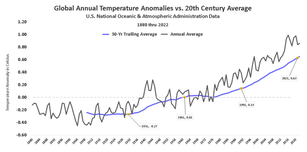

Our analyses of NOAA’s data confirm that average global temperatures for every consecutive 30-year period since 1901 have gone up. And since there’s a 95% chance that each of these increases in temperature are not random flukes, we can say with confidence that the global climate is warming. This does not mean, however, that we can detect this warming by focusing on daily or even yearly data.
The suspect practices don’t end there. NOAA and other scientific organizations not only regularly confuse weather with climate, they also ignore the measurement error inherent in the temperature data. This means the data actually have a range of possible values, not a single exact value. This fact is important because accounting for statistical significance is vital to analyzing changes over time. Ignoring confidence intervals in the scientific realm is particularly concerning as it risks creating a false sense of certainty—yet it’s done regularly.
For example, NOAA maintains that 2022’s global temperature anomaly of 0.86°C, up from 0.84°C in 2021, makes it the “sixth hottest” year in 142 years of recorded history. This sounds compelling. But is it actually what the data tell us? Not necessarily. The temperatures and rankings NOAA likes to emphasize may be precise, but they are not certain. 6
To demonstrate the uncertainty involved, we created a chart that shows the mean annual global temperature anomaly as reported by NOAA starting from 1995. We chose this year because it is the earliest for which we could find annual confidence intervals. The interval bars show the mean for the year as a dot, while the highest and lowest temperature ranges that are 95% likely to be true as end ticks.
At the 95% confidence level, NOAA’s 2022 data for example carry a +/-0.15°C confidence interval. This means the actual temperature anomaly for the year ranges from a high 1.02°C (denoted by the top tick) to a low of 0.72°C (denoted by the light gray dash at the bottom tick). The blue dot and light-blue dash mark the midpoint value for 2022 of 0.86°C . 7
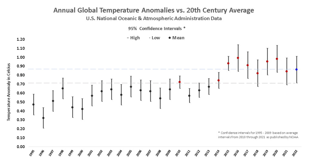
Comparing only midpoints shows that in five years—2015, 2016, 2017, 2019 and 2020—the average annual temperature exceeded that of 2022. Based on this method of comparison, NOAA ranks 2022 as the sixth hottest year on record.
NOAA’s approach seems straightforward enough, but there’s a very real rub. The approach only ranks years accurately if the midpoint of the range matches the actual temperature anomaly for each year. We don’t know this is the case.
In fact, NOAA’s own descriptive data indicate that not only can we not be certain 2022 was the sixth hottest year on record, we can’t be certain it was even in the top nine hottest years. This is because there are a total of nine prior years in which either the upper bound of the possible temperature range exceeds that of the 2022 midpoint or that the year’s midpoint exceeds that of the lower temperature bound for 2022.
The fact is the data only give us a range of possible anomalies, not single points. We may want definitive values to tell us exactly where a given year ranks in climate history, but referencing midpoints exclusively as NOAA’s reports do does not give us that. It instead feeds public desire for certainty in climate science, whether scientists operate under that certainty or not.
Even where there is certainty, it may not be reported if it does not sharpen the picture that NOAA seems to be painting. For example, there’s no statistical difference between the mean temperatures in 2022 and three-fourths of the 12 prior years, a point we rarely see acknowledged in discussions of the data—either by scientists or the news media.
So, how should NOAA have reported on 2022 in the interest of public understanding? One way would have been to describe the year as “statistically tied for first.” But this would be a bit disingenuous since nine other years also arguably tie for first. It would also overstate the likelihood that 2022 ranks as hottest. A more forthright way would be to report 2022 as ranking as “one of the 10 warmest years on record.”
The current way scientists hype annual comparisons with no regard for sampling error is questionable. The way they promote monthly comparisons would be altogether laughable if it weren’t so misleading to the public perception of climate change. Monthly data not only carry sampling error, they are far more narrow in their time span than even annual numbers. Yet, note NOAA’s reporting of global temperatures for October 2021:
“According to NOAA’s October 2021 global climate summary, Earth’s average surface temperature in October was 1.60 degrees Fahrenheit (0.89 degrees Celsius) warmer than the twentieth-century average of 57.2 degrees F (14.0 degrees C). That makes the past month the fourth-warmest October in the 142-year record.”
NOAA: News & Features, November 16, 2021
NOAA’s again gotten carried away. In reality, with sampling error considered, the most we can say statistically is that October 2021 is somewhere between the warmest October in measured history and the 8th warmest, inclusively. It can’t (and shouldn’t) be legitimately asserted that the month ranks precisely fourth.
NOAA’s reporting monthly records may make for regularly titillating headlines, but they add little to our understanding of climate trends. Setting a temperature record for a given month—or a given year, for that matter—tells us virtually nothing about global climate change. NOAA has, in our opinion, most certainly misled the public by making claims about global climate trends and records based only on midpoints, without accounting for the statistical significance of the differences among the reported annual temperature means. Other climate, meteorological and scientific organizations have done the same. 1
All of this has led us to a bad place. For decades scientists, climate activists and United Nations officials have been cherry-picking weather events to support their agenda of alarmism. They started with exhaustive analysis of yearly data, then moved to monthly. Some are now even using weekly and daily fluctuations to scare us into believing that the end is near.
Not only are these tarot-card tactics morally and ethically wrong, they’re also scientifically and analytically flawed—like trying to guess where a dog is going to end up by tracking and extrapolating out every twitch and turn of its leash. It’s misleading, distracting, and ultimately counterproductive. This clever animated short explains it well. 16
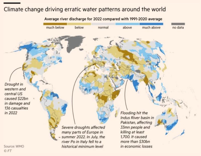
An example of how both scientific organizations and the media mix climate data and weather data when it meets their needs was published in the Financial Times in October 2023. In an article titled, “Global water cycles are spinning out of balance, weather agency reports,” FT included a graphic purportedly detailing how global water patterns are changing due to climate change.
In reality, the graphic shows something perfectly normal. Some areas of the world are showing some river discharge levels in the single year of 2022 as being much lower than the thirty-year average ending in 2020, some as being normal, and some as above or much above. This is exactly what one would expect when comparing single year’s or season’s weather to 30-year climatology. It’s called variability—in this case, likely exacerbated by La Nina.
While climate change is likely impacting the global water balance, there’s little evidence of it in the FT’s graphic. A more appropriate comparison would be of average discharge levels for the thirty years ending 2022 vs. 1992.
The 100-Year Flub
The misleading practices don’t end there. Hardly any throw-about weather-event term misleads as often as the “100-year” flood.
As a statistical matter, a 100-year flood refers to an event that has a 1-in-100 chance of occurring in a given year. The U.S. Geological Survey measures water heights and quantities at 7,500 locations, calculating the likelihood of severe flooding with 90% confidence. The standard was adopted federally in the 1960s as a basis to calculate risks for the new National Flood Insurance Program. 17
As an unintended consequence of its use, some property owners may hear the phrase and believe that if they’ve witness one major flood event they are safe for the next 100 years. In reality, a 1-in-100 chance each year equates to a 26% chance that a home in a floodplain will be inundated in the next 30 years—the life of a typical mortgage. Media reports that don’t clarify these statistics can lead to homeowners walloped by a big storm becoming overconfident and failing to prepare for the next. 17
Not only does the 100-year standard mislead property owners, it also sets an unrealistically low bar for cities planning for flood mitigation. Take Houston for example. The city soaked under three 500-year floods between 2015 and 2018. With a 0.2% probability for each flood in any given year, the odds of the trifecta of storms that occurred in such a short span was upwards of one in 125 million.
How can something with such astronomical odds seem to be so commonplace? One explanation is immense number of locations monitored. For example, the USGS monitors approximately 7,500 of them across the nation. That’s a lot of opportunities to register a record event. Assuming each of the locations’ measurements are entirely independent, there’s a 90% probability that a 100-year flood event occurs somewhere across the network every 11 days. Even if we assume perfect correlation among, say, groups of ten neighboring measurement locations, the interval between 100-year events is still just 3.7 months on average—almost three per year. 23
There’s also the issue of where specifically, and even why, cities might experience flooding. In Houston, some parts of the city were submerged repeatedly during the 2015 to 2018 period, while others avoided flooding altogether. That the 100-year flood zone designations were relatively poor predictors of where flooding occurred implies that variables other meteorological conditions were at play.
For instance, the 100-year benchmark as established by the USGS takes into account river and stream flooding but ignores breaches caused by factors like construction and drainage problems. Between 1978 and 2008, almost half of Houston’s flooding fell outside of areas in the 100-year floodplain. 18
In short, the 100-year floodplain designation is a moving target that may do little to prepare property owners for increased occurrence of flooding. Even so, climate-obsessed politicians and activists regularly weaponize the 100-year declaration to justify expensive or unproven initiatives. 19
Weather extremes would prove less surprising if records were presented in context. This is particularly the case given how the large number of locations and weather metrics that can be monitored increases the odds of 100-year events occurring. To be sure, a journalist or a climate activist “shopping” for extreme weather has a rich and ongoing selection of opportunities from which to choose.
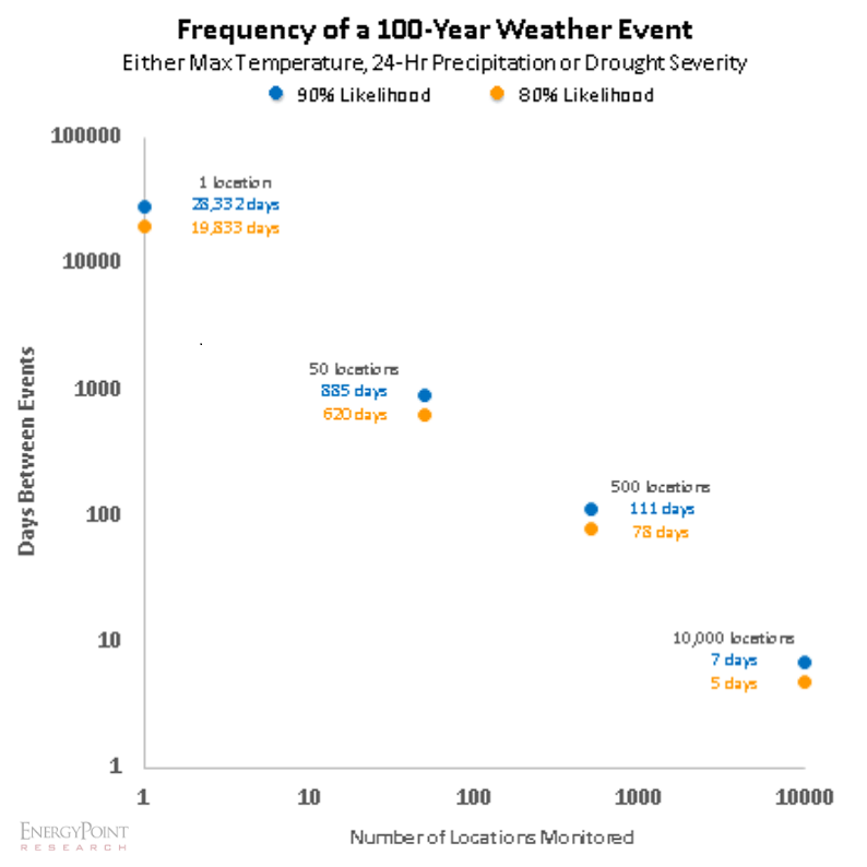
To demonstrate, we built a model to calculate and plot the number of 1-in-100-year events expected over a given period as observed at 50 dispersed locations—for example, one in each US state. The model suggests a 90% likelihood that at least one 100-year event of one of three independent types—maximum temperature, 24-hr precipitation, or drought severity—will occur in at least one of the 50 locations approximately once every 885 days (2.4 years) on average.
But that’s only a single monitoring location for each state. The span per extreme event falls to once every 111 days if the number of monitored locations per state is increased to ten. And to once every 7 days if we expand the locations to 10,000 locations—a little over three per county in the US—or about 50 per country globally.
If we were so industrious as to place a single monitoring station in each of the 196 million square miles comprising Earth’s surface, we could expect a 100-year event every 13 seconds on average.
Looking at weather extremes through the lens of our model’s admittedly narrow scope of inputs brings to view how commonplace weather extremes can be. Yes, our model ignores the context of recent historical data just as NOAA’s does. But even with that context, planners may still be caught off-guard by the frequency of such events because the weather data used to come up with 1-in-100-year standards are outdated. In the time it takes the USGS to adopt new standards, weather patterns have changed.
NOAA’s precipitation data figure into the calculations that become atlases for flood management. Most states currently rely on Atlas 14, the most recent available for most of the continental U.S. according to NOAA. The volume took 20 years to complete. Only Texas’ and Northeastern states’ projections have been updated within the past five years. Eleven states depend on Atlas 2, which includes 50-year-old data. 24
In the meantime, Earth’s climate is changing, leading to more frequent extreme events. A quick glance at NOAA’s extreme precipitation data shows a much wetter present than the period from the 1960s-90s, the basis for some current benchmarks. That means today’s planners—and likely some insurers—are making mitigation decisions based on outdated data.
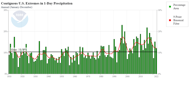
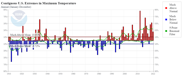
It’s not just precipitation. Charting heat and drought extremes, in the wake of a more moderate period going back to 1960, also renders an escalating curve over the past 30 years. These lags expose a challenge for predicting and communicating weather extremes—that is, the historic data in all cases is simply too old and the length of data records too short to properly represent the effects of climate change.
The age of data is not the only issue. Non-stationarity, the way statistical means for weather events in a warming climate change over time, complicates predictions derived from historical data. The NOAA atlases do not take this into consideration.
“This implies extreme precipitation storms with a low likelihood (e.g., 1% chance of occurring in any given year for a 1-in-100-year event) are not as rare in the current climate as their established probabilities make them out to be,” First Street Foundation (FSF) concluded in a report released in 2022. “As a result, we could experience more flooding in our life span than expected, and infrastructure designed based on the current national standards is not able to protect the public from the level of severe flooding that could occur.” 21
FSF, which sets out to project climate risks, estimates that what have been known as 1-in-100-year events may actually occur every eight years. But the scenario should not raise alarm. Rather it acknowledges that we are perhaps too alarmed by not-exceedingly-rare weather extremes.
Using up-to-date information and applying the correct statistical methodologies have enormous implications beyond clarifying expectations for the public. For example, spending from the $1.2 trillion Infrastructure Investment and Jobs Act has already begun. It is easy to see how billions might be spent on mitigation projects designed to these insufficient standards.
This fact alone should inspire urgency from FEMA, NOAA and the USGS. The Government Accountability Office—a government auditor and investigator that reports to the US Congress—said as much in its 2021 assessment of FEMA’s flood mapping. The GAO recommended FEMA develop a framework to measure the efficacy of its methods and leverage statistical analysis tools when setting priorities for funding. To date, FEMA has implemented new tools for funding decisions, but has yet to establish performance measures for addressing flood hazards. 22
For now, 100-year-flood is a 20th-century term with little meaning in the 21st century.
Small Data, Big Conclusions
NOAA scientists and others seem to think that comparing annual and monthly temperatures can reveal clear patterns of climate change. But this may be a case of the “Law of Small Numbers” at work.
The term, attributed to Nobel laureate Daniel Kahneman and Amos Tversky, refers to a common cognitive bias that leads researchers to make sweeping generalizations based on limited data. In this case, it’s the assumption that the effects of climate change, which are measured and understood using 30-year annual averages, can also be seen in the variations of yearly and monthly temperatures as well. 8, 9, 20
According to Kahneman, this bias stems from the brain’s tendency to create a coherent picture of the world based on sparse evidence. A person who jumps to conclusions often behaves as if this bias is true. It also results in a representation of reality that’s too neat and tidy for objective observers, who often end up crying foul.
The overconfidence that NOAA’s researchers have in smaller samples has the effect of making the public more likely to focus on the urgency of researchers’ messages than on their accuracy. As a consequence, we end up with a view of the world that is simpler and more consistent than the data warrant. Because NOAA overlooks the role of chance in the outcomes, so do we. 10
Attribution, Or Best Guess?
Other biases are also being introduced in the emerging field of climate attribution, a new field of science that tries to understand how climate change influences individual weather events such as heat waves, polar vortexes, rainstorms and tornadoes. Attribution scientists use custom models to assess how much more likely or severe such events—particularly the most extreme ones—are to occur today as a result of human greenhouse gas emissions.
Beyond examining weather phenomena, these models portend dire natural occurrences—droughts, floods and famines, for example—may become more frequent or intense with climate change. World Weather Attribution (WWA), a collaboration between ECI and the University of Oxford, describes the process as “simulat[ing] possible weather in the present climate (with anthropogenic climate change), with possible weather in the climate as it would be without man-made climate change. Subsequently, the probability of the investigating extreme event in both worlds is compared.” 11
These so-called “event attribution studies” have attracted a lot of attention from sectors like banking and insurance, which have stakes in industries and regions that may be significantly affected by climate change. They are concerned about both sudden and gradual extreme events—like Category 5 hurricanes and multi-year droughts—that may affect their businesses. 12
Practitioners of attribution science increasingly claim their methods can link weather events to anthropogenic climate change (AGW) with measurable degrees of certainty. This is problematic as their results fail to meet a key criterion of the scientific method—that a null hypothesis, in this case that AGW causes an extreme weather event, is able to be rejected via observation and experimentation. But since we can’t observe Earth’s modern-day climate and weather without AGW, how can we test the hypothesis?
The solution scientists say is to model things. But the use of models to predict an unobservable event only adds more uncertainty to the conclusions, raising more questions. What are the inevitable unknown dependencies? Where is Simpson’s Paradox lurking? What biases did the scientists introduce in creating their model? Scientists can say their models are right, but we can’t know this with any real confidence. 13
Buying into event attribution is akin to claiming we can accurately model IBM’s financial performance and stock price in 2023 as if Microsoft had never developed and launched Windows, the dominant operating system, in the 1990s.
How could we possibly test the validity of such a counterfactual scenario? Imagine a financial analyst claiming Windows was responsible for IBM’s earnings in 2023 being five times worse than they would have been but for the existence of Windows. The logical response of most investors would rightfully be deep skepticism.
Yet this is exactly what some climate scientists and activists do when they attribute extreme weather events to human-caused climate change. They use complex computer models riddled with uncertainties and assumptions to simulate a hypothetical world without greenhouse gas emissions. They then compare the results with the observed reality and assume a causal link.
This is not science, but speculation. There is no way to verify or falsify the conclusions of attribution studies, because we only have one Earth and one history. The models are not reliable enough to fully capture the natural variability and complexity of the world’s climate system, let alone human influences. Incomplete or inconsistent data on extreme weather events only adds to concerns.
Event attribution is a misleading and unscientific way of communicating the risks of climate change. Climate expert Steven Koonin agrees. In his book, Unsettled, noting that attribution studies are “rife with issues,” he argues—
“There are many reasons for science’s generally low confidence in detecting changes in extreme weather events and then attributing them to human influences. These include short and low-quality historical records, high natural variability, confounding natural influences, and disagreements among the many models used.
Yet even though we’ve little evidence of much changing, the media maintains a flow of news connecting weather events to climate—in part, by relying on what are called event attribution studies…”
In his analogy, Koonin points out that scientists who claim to know a particular weather event was made more likely or severe by AGW are like “spiritual advisors” who claim their influence helped an individual win the lottery—after they already won it. The way to test their extraordinary claim is to play the lottery many times with their help and see if we win more than others who do not receive such help. 14
Now imagine having one chance to play the lottery, without the ability to repeat the experiment. That’s the situation we face with climate change—we have only one Earth with single pre- and post-industrial eras to work with. The possibility of replicating multiple experiments to eventually substantiate the findings isn’t an option.
The problems with attribution studies don’t end there. They ignore nagging uncertainties regarding the exact relationship between greenhouse gases (GHGs) and global temperatures. To be sure, we know that humans have played a role in the 1.1 C warming of the planet since the pre-industrial age. But we don’t know exactly how big that role is. We also don’t know how much more the temperature and other aspects of the climate will change as greenhouse gas emissions increase.
The rise of attributions studies is also concerning beyond the realm of climate change. If we accept attribution models as truth, there’s little they couldn’t theoretically be used for. We could use them to blame almost anything on anyone. For instance, one might create a model “proving” Wall Street banks caused more unemployment and crime in poor neighborhoods by adopting green policies. Or one could sue environmental groups for causing wars, famines, poverty and death in Africa by blocking the continent’s nations from obtaining cheap energy sources.
How could the innocent parties ever prove their accusers and their models wrong? The answer is they couldn’t—not any more than the models could “prove” their findings are valid. Attribution studies are not based on facts, but on guesses. Their findings only slicken an already slippery slope for scientists and society.
In response to these and other criticisms, some attribution studies now try to use historical data instead of simulations. But this is still a flawed approach. Historical data are not complete or perfect representations of the past much less the current natural world. They are influenced by many factors that are hard to account for or isolate. Using them as proxies is a guessing game, not a scientific method.
Given their reliance on uncertain assumptions and other-worldly modeling, results from climate attribution studies are best viewed as educated guesses. Moreover, even if we accept the questionable precision of their findings, their results reveal little that’s new or useful. Most notably, they shed no light how much of an extreme event was actually caused by man-made emissions. It could be a tiny fraction or a significant chunk. We don’t know—, and neither do the attribution scientists or their models.
Questionable Science, Misleading Reporting
Despite these issues, the media continue to report the findings of attribution studies as if they were solid science. Many scientific institutions endorse and use them to justify their calls for urgent action on greenhouse gas emissions. For example, NOAA Chief Scientist Sarah Kapnick, said:
“These studies contextualize recent extreme events, explaining how the risk for them is changing in time, and highlighting how climate change is making them more likely or severe. By helping quantify these evolving risks and what is causing them, we can help communities plan and prepare for the future with a better sense of what lies ahead.” 15
In an apparent show of support for these studies, NOAA featured on its website a study that pointed out that the average temperature in South Korea in October 2021 was almost 7 F higher than the average from 1991 to 2020. The study’s models suggest that this was a once-in-6,250 years event. NOAA warned this kind of heat “could become a new normal” in South Korea by 2060 if nations don’t cut global emissions. 15
The study’s precise conclusion concerning the rarity of the event in South Korea is meaningless. And what does “could become a new normal” mean? Does it mean that it will happen every year, every decade, or every century? What is the probability of it happening?
Researchers are clearly employing misleading statistics and vague language to exaggerate the risks and scare the public. Note NOAA’s use of “could become” rather than citing the actual or estimated probability of the event occurring. This allows any slight risk to be dressed up as something more alarming.
Researchers use other tricks as well to make rare events seem more common. For example, a study might say the chance of Dallas reaching 105 F in March at least once in the next 20 years is now “ten times greater” than 50 years ago because of climate change. That sounds alarming. But it wouldn’t be if it were revealed that the tenfold increase in risk is from a 0.01% chance to a 0.1% chance. Both values are almost zero.
Attribution studies are neither scientifically informative nor useful. They are mostly speculative and deceptive, further polarizing and politicizing the public debate. More importantly, they are not helping us understand or prepare for climate change. Until fully abandoned, they should be ignored.
Conclusion
Too many claims about global climate trends and records are based on misleading statistics that ignore the uncertainty and variability in the data. Researchers and their organizations regularly present a distorted picture of climate reality that exaggerates their own confidence and authority.
The public deserves to know that climate studies and their findings are based on solid scientific evidence and methods, not on sensationalized or distorted assumptions and claims. The scientific community and the media have a responsibility to present the data in clear and honest ways that comport with scientific norms, even if it means using more general and less dramatic terms than they might prefer. This includes admitting that we don’t currently have the answers in certain cases.
Only by being more transparent and accurate about the nature and meaning of climate data can NOAA and other scientific organizations like it regain the trust and confidence in their messages that existed decades ago. Until then, large portions of the public will keep doubting the validity and relevance of their findings.
Meanwhile, too many climate and environmental scientists have arrogantly presumed for too long the right to dictate that Earth’s eight billion people follow their prescriptions for everything from the food they eat to the cars they drive to the power they use—all based on what is a parochial and self-serving expertise. The fact is climate scientists are not qualified to make sweeping judgments about the nexus of trade-offs and costs of their policy proposals.
It’s important to remember that climate scientists aren’t economists, ethicists, CEOs, jurists, sociologists, elected officials, anthropologists, nutritionists, or physicians. Far from it. They have little grasp of the complex and dynamic forces that shape human societies and cultures. Yes, their warnings deserve our consideration, but not our unquestioning buy-in, submission or obedience.
Note: Other issues that we’ll cover in updated versions of this post include integrity of data collection methods, and more.
This article was originally published on November 22, 2021. It was last updated as of the date indicated atop the post’s heading.
References & Notes
- Cornell Statistical Consulting Unit. (October 2008, September 2020). Overlapping Confidence Intervals and Statistical Significance. https://cscu.cornell.edu/wp-content/uploads/73_ci.pdf. Note: It’s a common misconception that overlapping 95% confidence interval bars indicates that the difference in the means of the two respective populations or samples is not statistically significant. In reality, upper and lower 95% confidence-interval bounds for the means of two samples or populations that just touch indicates statistical significance at p = 0.005 (99.5%), not the the oft-presumed p = 0.05 (95.0%). This significance at 99.5% is beyond the presumed certainty of 95% and implies that some overlap between intervals can exist and the difference in means can still be significant at 95%. Our ranking method considers the difference between mean temperatures to be statistically significant only if the upper or lower bound of the 95% confidence interval for either year does not overlap with the mean of the other year. This approach test runs the risk of ranking a year’s mean temperature slightly higher than it might deserve, but still more appropriately than what NOAA’s method of comparing only means generates in terms of rankings.
- NASA. (2023, June 20). Global Warming vs. Climate Change. Retrieved from NASA: Global Climate Change: https://climate.nasa.gov/global-warming-vs-climate-change
- National Oceanic and Atmospheric Administration. (2023, January 12). 2022 was world’s 6th-warmest year on record. Retrieved from NOAA: https://www.noaa.gov/news/2022-was-worlds-6th-warmest-year-on-record
- World Weather Attribution. (2022, December 21). Climate change made record breaking early season heat in Argentina and Paraguay about 60 times more likely. Retrieved from World Weather Attribution: https://www.worldweatherattribution.org/climate-change-made-record-breaking-early-season-heat-in-argentina-and-paraguay-about-60-times-more-likely
- National Oceanic and Atmospheric Administration. (2023, May). Global Time Series. Retrieved from National Centers for Environmental Information: https://www.ncei.noaa.gov/access/monitoring/climate-at-a-glance/global/time-series
- United States Census Bureau. (2021, October 8). A Basic Explanation of Confidence Levels. Retrieved from Guidance for SAIPE Data Users: https://www.census.gov/programs-surveys/saipe/guidance/confidence-intervals.html
- National Oceanic and Atmospheric Administration. (Annual Reports, 1995 – 2022). Retrieved from National Centers for Environmental Information: https://www.ncei.noaa.gov/access/monitoring/monthly-report
- Tversky, A., & Kahneman, D. (1971). Belief in the law of Small Numbers. Psychological Bulletin, 105-110.
- Sands, L. (2023, July 5). This July 4 was hot. Earth’s hottest day on record, in fact. Retrieved from The Washington Post: https://www.washingtonpost.com/climate-environment/2023/07/05/hottest-day-ever-recorded
- Rood, R. (2023, June 20). 2023 El Niño Temperature Alarm. Retrieved from Open Climate: https://openclimate.org/2023-el-nino-temperature-alarm
- Environmental Change Institute. (n.d.). Retrieved from World Weather Attribution (WWA): https://www.eci.ox.ac.uk/research/climate/world-weather-attribution.html
- Basel Committee on Banking Supervision. (2021, April). Climate-related financial. Retrieved from Bank for International Settlements: https://www.bis.org/bcbs/publ/d518.pdf
- Young, C. (2018, May 14). Model Uncertainty and the Crisis in Science. Retrieved from Socius: https://doi.org/10.1177/2378023117737206
- Koonin, S. (2021). Unsettled: What Climate Science Tells Us, What It Doesn’t, and Why It Matters. BenBella Books
- National Oceanic and Atmospheric Administration. (January 9, 2023) https://www.noaa.gov/news-release/climate-attribution-tools-critical-for-understanding-extreme-events
- Animated short on statistics from Norwegian infotainment program Siffer. Produced by TeddyTV for NRK. Animation by Ole Christoffer Haga.
- Holmes, R. J., & Dinicola, K. (2010). 100-Year flood–it’s all about chance: U.S. Geological Survey General Information Product 106. Retrieved from United States Geological Survey: https://pubs.usgs.gov/gip/106/pdf/100-year-flood_041210.pdf
- SSPEED Center. (2019). Neighborhood-Scale Floodplain Analysis and Flood Mitigation Study for Greens Bayou Watershed. Houston: Severe Storm Prediction, Education, & Evacuation from Disasters Center. Retrieved from https://8ed4fb93-0a65-4904-a19c-83610559d0e9.filesusr.com/ugd/d29356_6f75148ffddf435191b7103527bd263b.pdf
- Hanzas, S. C. (2023, July 28). Sarah Copeland Hanzas: Time for the governor to pivot on climate policy. Retrieved from VT Digger: https://vtdigger.org/2023/07/28/sarah-copeland-hanzas-time-for-the-governor-to-pivot-on-climate-policy/
- Sands, L. (2023, July 5). This July 4 was hot. Earth’s hottest day on record, in fact. Retrieved from The Washington Post: https://www.washingtonpost.com/climate-environment/2023/07/05/hottest-day-ever-recorded/
- Kim, J. (2022). A New Normal: Exposure of the U.S. Population to Extreme Precipitation. Journal of Hydrology: Regional Studies
- FEMA Flood Maps: Better Planning and Analysis Needed to Address Current and Future Flood Hazards. (2021, October). Retrieved from U.S. Government Accountability Office: https://www.gao.gov/products/gao-22-104079
- To counter the confusion, USGS has made a push to replace 100-year flood with the more accurate 1-percent annual exceedance probability (AEP). The term may not roll off the tongue as easily, but it does represent what the agency actually estimates. For now, media and agencies should more accurately describe extremes as probabilities rather than as ominous and hollow 100-year floods.
- NOAA. (n.d.). Office of Water Prediction. Retrieved from Current NWS Precipitation Frequency (PF) Documents: https://www.weather.gov/owp/hdsc_currentpf
- The government’s Automated Surface Observing Systems has more than 913 operational observation stations in the U.S. It is believed that these stations are a subset of the 7,500 stations monitored by the USGS.



Fantastic report.
Thank you, Richard. Glad to know you found it worth the read.
This is a brilliant article. Even for those of us who just like to read and gather information.